Summary
Everyday apps feel effortless because of hundreds of invisible design decisions working together. This article explains the subtle UX, psychology, and interface choices behind the apps Americans use daily—why buttons feel “right,” why defaults matter, and how small design details drive trust, retention, and usability without users ever noticing.
Most people don’t think about why an app feels easy to use. They just know when something feels smooth—or when it doesn’t. That sense of effortlessness is rarely accidental. It’s the result of deliberate, often invisible design decisions that shape how users move, decide, and feel inside digital products.
In the U.S., where mobile app usage exceeds four hours per day for the average smartphone user, these design choices quietly influence everything from how we manage money to how we communicate, shop, and work. The best designs don’t call attention to themselves. They reduce friction, build confidence, and guide behavior without requiring conscious thought.
This article breaks down the subtle design patterns behind everyday apps, focusing on real-world usage, behavioral science, and practical examples drawn from widely used consumer software.
Why “Invisible” Design Matters More Than Flashy Features
Good design is rarely about decoration. It’s about removing obstacles.
When users open an app, they bring limited attention, limited patience, and clear intent. Subtle design decisions—spacing, wording, defaults, feedback—either support that intent or quietly undermine it. According to usability research from Nielsen Norman Group, users typically leave a confusing interface within 10–20 seconds, often without being able to explain why.
Invisible design matters because:
- Users blame themselves before they blame software
- Confusion reduces trust faster than missing features
- Cognitive overload leads to abandonment, not complaints
Well-designed apps feel obvious in hindsight, even though they’re anything but.

The Power of Defaults: Why Most Users Don’t Change Settings
Defaults are one of the most influential design tools—and one of the least noticed.
Most users never adjust settings unless something goes wrong. Behavioral economists call this the “status quo bias,” and it’s been repeatedly confirmed in digital environments. A study frequently cited by Baymard Institute shows that default choices strongly shape user behavior, especially in checkout flows and account setup.
In everyday apps, defaults quietly answer questions users never want to think about:
- Should notifications be on or off?
- Is this public or private?
- What’s the “normal” choice here?
Designers who choose thoughtful defaults reduce decision fatigue and make users feel instantly competent. Poor defaults, by contrast, create frustration that feels personal—even when it’s systemic.
Microcopy: The Small Words That Prevent Big Mistakes
Microcopy refers to short bits of text—button labels, helper text, error messages—that guide users through actions. It’s one of the most underestimated elements in app design.
Consider the difference between:
- “Submit”
- “Save changes”
- “Send message”
Each label carries different expectations. Ambiguous language forces users to pause and evaluate risk, which breaks flow. Clear microcopy reassures users and reduces errors without adding screens or instructions.
Well-written microcopy often:
- Explains consequences before actions occur
- Uses familiar, conversational American English
- Anticipates user anxiety (especially around payments or data)
The best microcopy feels human, not corporate—and it quietly earns trust over time.
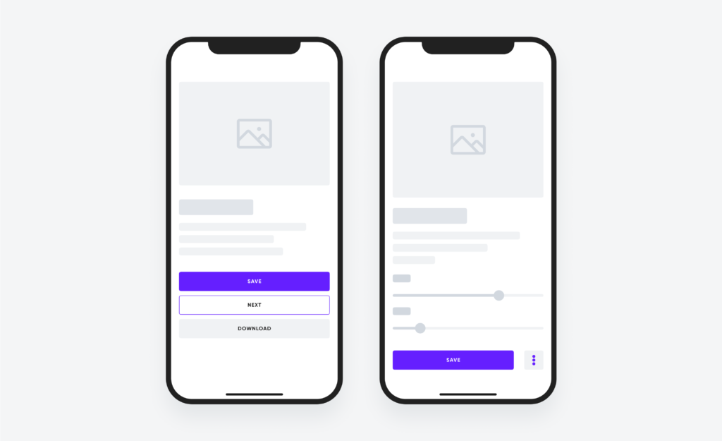
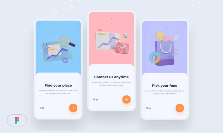
Visual Hierarchy: Why Your Eye Knows Where to Look
When an app opens, users instinctively know where to tap first. That’s not intuition—it’s visual hierarchy.
Designers use size, color, contrast, spacing, and alignment to signal importance. Primary actions stand out. Secondary actions recede. Destructive actions are visually restrained to prevent accidental taps.
This hierarchy works because it mirrors how the human visual system processes information. Research consistently shows that users scan interfaces in predictable patterns, prioritizing bold elements and clear groupings.
Effective visual hierarchy:
- Reduces the need for instructions
- Speeds up task completion
- Makes complex screens feel manageable
When hierarchy fails, users hesitate. When it succeeds, users feel “in control” without knowing why.
Timing and Feedback: The Science of Feeling Responsive
Responsiveness isn’t just about speed—it’s about perception.
Even when actions take time, good apps provide immediate feedback. Buttons animate. Loaders appear. Messages confirm success. These signals reassure users that the system heard them.
According to human–computer interaction research, feedback within 100 milliseconds feels instantaneous, while delays beyond one second require visible acknowledgment. That’s why subtle animations matter. They fill the psychological gap between action and result.
Everyday apps use feedback to:
- Prevent repeated taps
- Reduce anxiety during waiting periods
- Signal completion without interruption
When feedback is missing, users often assume failure—even when the system is working correctly.
Progressive Disclosure: Showing Less to Do More
One reason popular apps feel simple is that they hide complexity until it’s needed. This principle, called progressive disclosure, allows interfaces to grow with the user.
Instead of overwhelming first-time users with options, apps reveal features gradually:
- Advanced settings appear later
- Secondary actions stay tucked away
- Power tools surface only when relevant
This approach respects different experience levels and keeps core tasks fast. It’s especially important in U.S. consumer apps, where audiences span wide age and tech-literacy ranges.
Progressive disclosure turns learning into discovery rather than instruction.
Accessibility Choices That Benefit Everyone
Accessibility is often framed as a legal or ethical requirement, but in practice it improves usability for all users.
Features like larger tap targets, readable contrast, voice input, and clear error messages help people with disabilities—and also benefit users in noisy environments, bright sunlight, or stressful situations.
U.S. accessibility standards influenced by the Web Content Accessibility Guidelines have pushed everyday apps toward more inclusive design, even when users aren’t aware of it.
Inclusive design choices reduce friction across the board, not just for specific groups.
Trust Signals Users Rarely Notice—Until They’re Gone
Trust isn’t built through slogans. It’s built through consistency.
Everyday apps signal trustworthiness through small details:
- Predictable navigation
- Consistent terminology
- Reversible actions
- Clear confirmation states
When these signals disappear—unexpected pop-ups, unclear permissions, sudden layout changes—users feel uneasy. Trust erodes quickly, even if the app remains functional.
In financial, health, and productivity apps especially, subtle trust signals determine whether users stay or leave.
Why Users Say “It Just Works”
When people say an app “just works,” they’re responding to dozens of invisible decisions aligning at once. Nothing feels confusing. Nothing feels risky. Nothing demands extra thought.
That’s the goal of subtle design: not to impress, but to support.
Great apps don’t teach users how to use them. They adapt to how users already think, read, and decide—especially within the cultural expectations of U.S. audiences accustomed to speed, clarity, and autonomy.
Frequently Asked Questions
Why do some apps feel easier to use than others?
Because they reduce cognitive load through clear hierarchy, thoughtful defaults, and predictable patterns.
What is the most important design choice in an app?
Clarity of primary action—users should always know what to do next.
Do small design details really affect user behavior?
Yes. Research consistently shows micro-interactions significantly impact trust and retention.
Why don’t users customize settings more often?
Most users accept defaults due to decision fatigue and status quo bias.
How do designers test subtle design choices?
Through usability testing, A/B experiments, and behavioral analytics.
Is accessibility only for users with disabilities?
No. Accessible design improves usability for everyone.
Why are animations used even when they slow things down?
They improve perceived performance and reduce user anxiety.
What causes users to abandon an app quickly?
Confusion, unexpected behavior, and lack of feedback.
Can good design increase user trust?
Yes. Consistency and predictability are core trust builders.
Designing for the Way People Actually Behave
Subtle design choices succeed because they respect reality. People skim. They hesitate. They forget. They make mistakes. The apps we rely on every day are designed not for ideal users, but for real ones—busy, distracted, and human.
When design works, it disappears. And that’s precisely the point.
Key Insights at a Glance
- Invisible design decisions shape user confidence
- Defaults influence behavior more than features
- Clear microcopy prevents costly mistakes
- Feedback and timing affect perceived speed
- Trust is built through consistency, not messaging